7

Nice to meet you all! I'm V2Blast, one of the other Community Managers here at Stack Exchange; I'm also working with the design team on the site themes project alongside Catija. I first want to thank you for your patience, and apologize that it’s taken so long to get back to you all after our initial post here.

Below, you'll find the proposed site theme for Gardening & Landscaping Stack Exchange that our designers came up with based on your original ideas, alongside some explanations from the designer (in their own words) about their design choices.


Your site design

We want to give you your own theme that reflects your topic, culture, and community. This will help brand your site as unique, even while you share common elements with other sites that show you are part of a bigger Stack Exchange family.

Logo & color scheme

My proposed logo for this site is a blooming flower. This represents a harmonious garden and a thriving community.

Proposed logo for the Gardening & Landscaping Stack Exchange site, as described above. The icon shows a white flower surrounded by green leaves on all sides. The text "GARDENING & LANDSCAPING" appears in white to the right of the icon, all set against a brown background.

Proposed logo for the Gardening & Landscaping Meta Stack Exchange site. It is largely identical to the proposed logo for the main site above, with a few main differences: the text says "GARDENING & LANDSCAPING META" instead, and the leaves and the word "META" appear in light gray instead (all against a dark gray background).

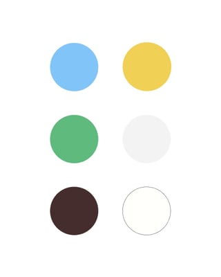
With this color scheme, the colors of gardening and landscaping work harmoniously together in very simple, unpretentious ways. The color of the sky, the sun, the grass, and the dirt. All of these fit with the word mark font choice to represent a down-to-earth community asking questions about the care and maintenance of gardens and landscapes.

Proposed color palette for the Gardening & Landscaping Stack Exchange site, incorporating 6 colors: blue, yellow, green, light gray, brown, and white.

Page design

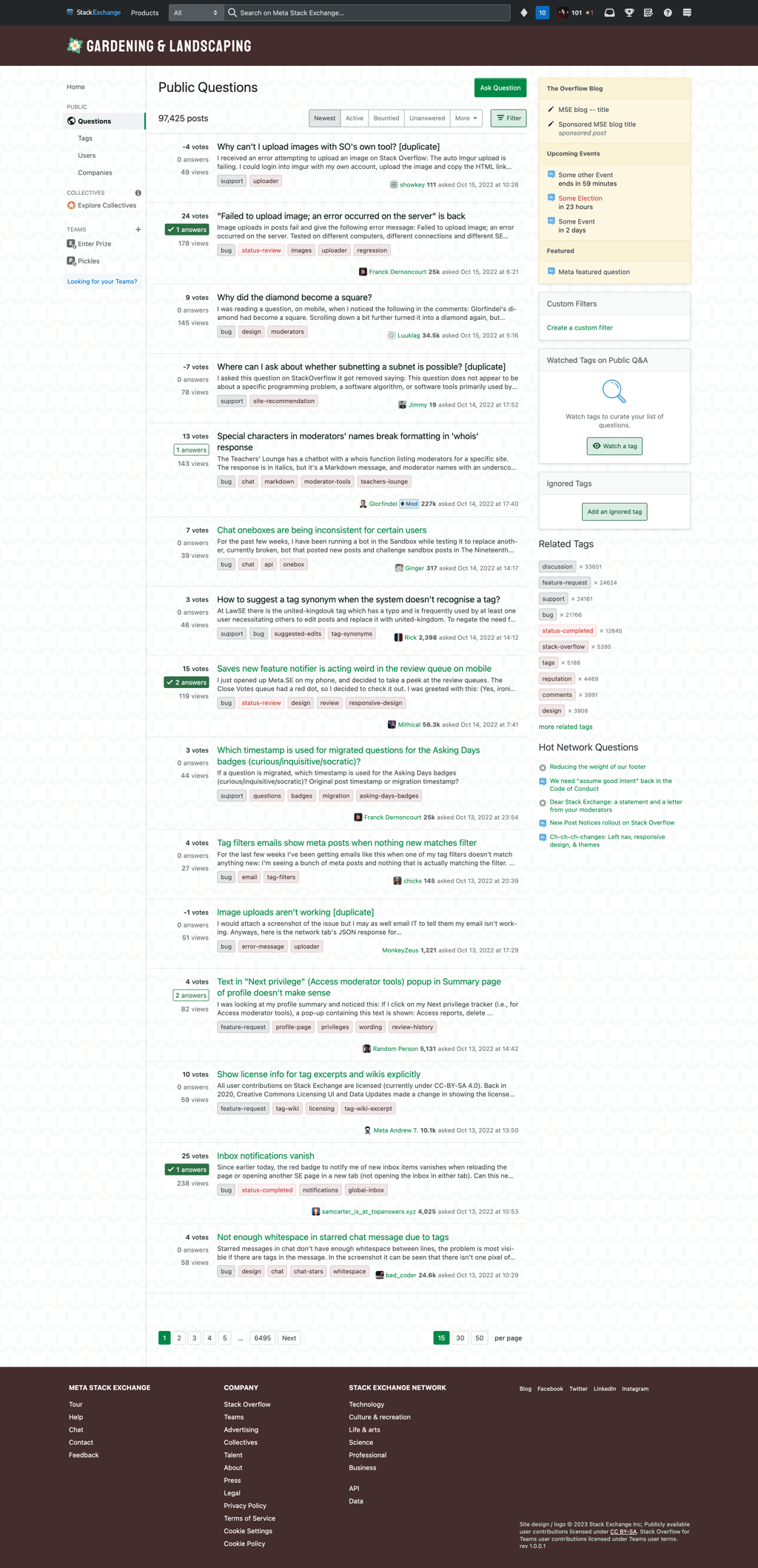
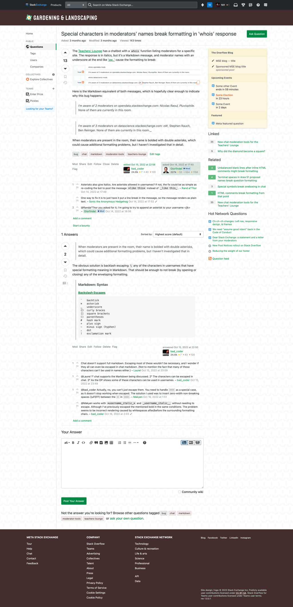
Here are some examples of how the site might look with this design (click to view full-size):

Proposed page design/style, showing the site's Questions page (/questions). The backgrounds of the header and footer of the page are a dark brown, while a faded plant design is tiled throughout the background in between. Question titles and other links appear in light green (or dark green for visited links), while regular tags appear with a brown background.

Proposed page design, showing a question page.

Thoughts?

We hope you enjoy this design, but if something doesn’t feel right, now is your chance to share your feedback. This window for feedback will be open for one week. We will then work to incorporate feedback as best as we can, finalize things on our end, and lastly, deliver the design to your site.

1

4 Answers 4

8

Thanks for the first draft, I think we’re on a good path already.

Below a few thoughts where I feel a bit of tweaking may make the design better.

  1. My knee-jerk reaction was to the flowers: While there are plenty of tetrameric flowers, the majority of flowers have one or multiple circles of three or five petals. For an abstract representation of a blossom, I feel either a simple five-petal design (think apple or cherry blossom) or six petals (like tulips) would better - it’s what humans tend to primarily associate with “flower”.

  2. I share kevinskio’s sentiments re. the shade of brown. It’s too dark, which makes it too sombre and severe. I get the “soil” association, but it nevertheless feels too much. I am fine with brown per se, but am open to other colors - a gentle green perhaps?

  3. The green from the color chart could be a hint more yellow, as most plants tend to have warmer (-> yellow) rather than cooler (-> blue) greens. That said, as a font color, I think a bit darker overall would noticeably improve readability. I struggled a bit when looking at the sample site, it was just that touch too light to read at a glance.

1
  • 1
    If we're going with a flower, we definitely need a five- or six-petalled one - after all, the "rule of odds" is a landscaping axiom, and in landscaping, six is an odd number (two sets of three...). I'd prefer a leaf or three leaves and a stem, tho, TBH.
    – Jurp
    Commented Feb 18, 2023 at 13:06
6

A different thought:

I am not convinced that - if we are going for one symbol only - a flower is the best choice. Flowers are one aspect of gardening and landscaping, but not the central one. A leaf would be much more common, symbolize growth and thriving beyond the short peak of a blooming season and also better encompass the landscaping part of our scope.

(Plus flowers are a touch in-your-face-obvious.)

5

Thanks V2Blast! We appreciate the effort. When I look at the mockups I try and record my initial reaction as that is the one that I don't overthink.

The dark brown colour of the header and footer is a bit grim. It does not make me think of being outside gardening. A blue like a blue sky or a green for a leaf colour would be better

2

I prefer mixed case over the all-caps logo - all-caps looks too severe and is NEVER a choice as a headline in technical writing. I also like serif fonts, but that's another discussion...

I agree with others that the brown is too dark and the green text too light. I disagree with the idea of using sky blue instead of brown, as medium blue or light blue and green are not, together, a pleasing combination. Dark blue (lighter than navy) and green work well together, though.

You must log in to answer this question.

Not the answer you're looking for? Browse other questions tagged .